On March 1, 2024, the gold future closes at 2,086.90 USD — for the first time durably above an upper edge at which the market had failed again and again since August 2020. For most observers this is a breakout candle like a hundred others: some momentum, some volume, a new high. Nothing about this candle reveals that a move of several hundred dollars begins here.
And that is the point: the candle does not reveal it. The answer stands to the left of it. Three and a half years of sideways phase, 21 columns wide on the point-and-figure chart — one of the broadest bases gold has ever built. On that day Wyckoff would not have looked at the breakout candle but measured the congestion: horizontally, column by column. Because his second law says that the effect of a move is proportional to its cause — and the cause is the width of the base, not the drama of the breakout.
The same logic also explains the counterpart every trader knows: the breakout that suffocates after three days. Same candle, same thrust — but to the left of it only a mini range, a few columns, barely any cause built. Few columns means little cause means little effect. Whoever compares only breakout candles cannot tell these two worlds apart. Whoever measures the cause can.
That leaves the question this post answers: how do you measure the force of a sideways phase before the trend proves it — and why is the popular shortcut, simply adding the range height, not the same thing? The tool carries out the original measurement, handle by handle. At the end stands the follow-up measurement against the real gold case: what the count said, what the market delivered, and where it was still open at the end of the data.
Why this instrument
Chapter 9.3 frames the three Wyckoff laws as three questions put to every market situation: who is the aggressor (supply and demand), how far can it go (cause and effect), is the move genuine (effort and result). This tool addresses the middle question — the proportion question. The law behind it, verbatim from the book: the cause, that is the consolidation phase, must be proportional to the effect, the subsequent trend move. The longer and wider the range, the greater the potential move after the breakout.
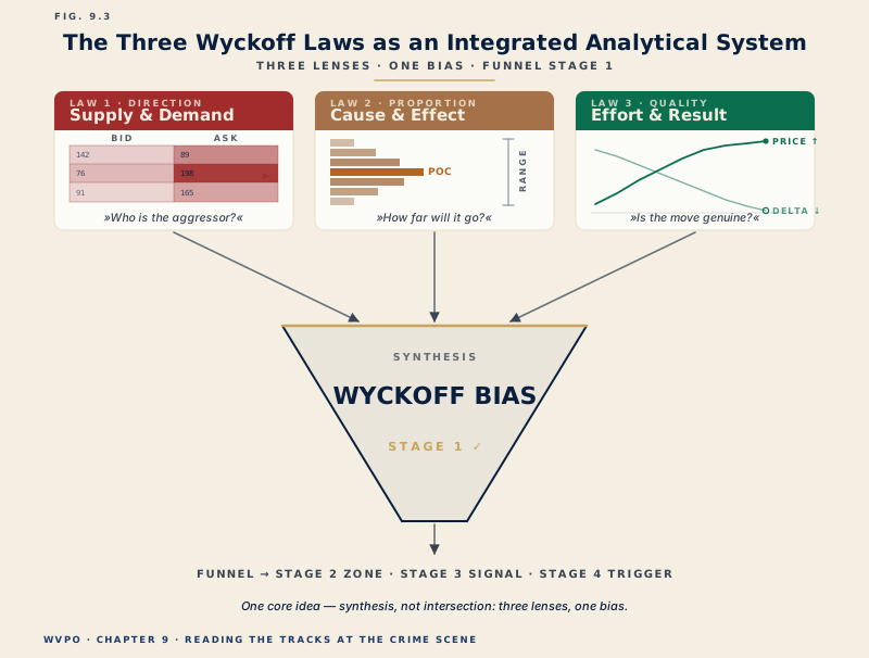
So much for the familiar half. The uncomfortable half stands in the honesty box of the same chapter, and it contradicts what most trading sites make of the law: Wyckoff's cause is counted horizontally. The widespread reading "30 points of range height, therefore a 30-point target" confuses the vertical height of the range with the measurement Wyckoff actually used. Canonically the count runs via the point-and-figure count: the number of columns in the congestion, multiplied by the box size and the reversal amount, projected from a count line. The deep-dive box in chapter 10 works it through and draws the conclusion that this tool turns into its program: the vertical measured move is a recognized, quick proxy — usable as a simplified minimum target, but honestly not the original count.
Why the horizontal measurement is the right one is explained by looking at what actually happens inside a range. Chapter 10 calls phase B "building the cause": the institutional accumulation in disguise. The larger the position the Composite Man builds, the more time he needs — and the larger the later move must be to unwind it profitably. Time here is not a side effect but a criterion. A P&F chart makes this time measurable precisely by removing it from the chart: it plots only movement, and a new column arises only when the market actually reverses. The width of the congestion in columns is therefore a more direct measure of the cause built than any calendar.
From this follows the core thesis of this post: the price target does not stand in the future, it stands to the left in the chart — horizontally. But read honestly, the count delivers a zone with a convention dependency, not a promise. It says how far a cause can carry, not that it will. And its most important by-product is a veto: breakouts from narrow bases are structurally suspect, no matter how good the breakout candle looks.
On the data basis, openly stated: the teaching range in the first three modes is a model construction built on the thresholds from chapter 10.5 — marked ◐ MODEL in the tool. The gold case, by contrast, is real: daily closing prices of the gold future 2020 to 2024, fact-checked, marked ● REAL DATA. The formula and the counting rules come from the WVPO knowledge base, the vetted rule set behind book, academy and app. Nothing here is a signal. It is a measuring instrument.
The tool
Begin in the translator and step forward candle by candle until the first reversal column arises — then you know what a P&F column is, and everything else builds on that.
◐ MODEL — teaching geometry built to the canon thresholds, not real data · Formula ● SSOT · Volume I ch. 9/10
The formula: Target = count-line level + columns × box size × reversal (accumulation; distribution mirrored downward)
A candlestick chart forms on the left, the P&F board on the right — and at every step you see which rule fires. Five candles can be zero boxes; one candle can be three. Step forward until the first reversal column appears.
Close reaches 6 new box(es) downward — the O column grows. No new column.
Tap a column: the tool highlights the candles that formed it. Some columns are one candle, some a dozen — P&F compresses time unevenly.
A teaching and analysis tool — no signals, no forecasts, no investment advice. The P&F count measures potential, not the future.
The guided tour — seven handles, one measurement
The order is deliberate: first understand how the board comes about, then measure yourself, finally the real thing. Take two or three minutes for each section.
1 · The two-worlds translator — candles become columns
What: On the left a candle chart forms, on the right the P&F board, and at each step the log shows which rule applies: the close reaches new boxes and the running column grows, or it moves within the noise and the board ignores the candle entirely, or the counter-move reaches three boxes and a new column begins. In the model the closing-price method applies, with a five-point box size and a 3-box reversal.
Why: Whoever knows P&F only as an exotic chart form underestimates how radical the translation is: the time axis disappears. A 30-point markdown candle writes six boxes onto the board, five quiet range candles write nothing at all. This very radicalness makes the count possible — only what the market achieved in reversals is counted, not how long it took.
Exercise: Step with "+1 candle" through the markdown to the first reversal message. Note at which candle it comes — and how many candles before it the board ignored entirely. That is the core of the translation.
2 · The time in the column — what P&F swallows
What: Tap a column. The tool marks in the candle chart the candles that formed it and shows the span: column, direction, boxes, candles from–to. In gold mode the date stands in place of the candle number — there some columns stand for days, others for months.
Why: P&F compresses time unevenly, and precisely therein lies the information. A column that took three weeks tells of tough, absorbed trade; a column from a single day tells of a thrust. For the count both count the same — a column is a column. Whoever has traced this once on the board understands why the count measures the cause and not the calendar: it counts reversals, not days.
Exercise: In the translator, find the column with the most candles and the one with the single candle. Then switch to gold mode and tap through the base: find the column that spans more than a month.
3 · The growing cause — phase B builds the target
What: In the "growing cause" mode you move the scrubber through the range. With every new column the display computes along: columns times box size times reversal equals projected effect, as a target mark directly in the chart. At two columns it is 30 points, in the middle of phase B 105, at the last point of support 150. Below it lies the contrast: a mini range, three columns, 45 points — this pause yields no more.
Why: Phase B is the phase in which retail loses interest — nothing is happening, after all. This mode shows what happens instead: every week of sideways movement, every additional reversal enlarges the later reach. The "boring" phase builds the price target. And the mini range beside it is the veto lesson in a single picture: a breakout from three columns has 45 points of tailwind, no trend.
Exercise: With the scrubber, find the candle at which the projected effect first becomes three-digit. Ask yourself how the chart feels at that point — probably like nothing at all. That is exactly when the cause grows.
4 · The count line — measuring is a decision
What: In the measuring lab you draw the count line to the row along which counting runs — with the pointer or in single-row steps by key. The canon places it on the row of the LPS level, 5,110 in the model, and counts from the last column of the congestion back to the selling climax. To go with it you choose the segment: conservative, only the core congestion from the secondary test, eight columns, target 5,230 — or maximal, the whole range from the selling climax, ten columns, target 5,260.
Why: The count is not an automatism that an indicator spits out. Where you count and how much you count are analytical decisions, and you must be able to justify both. The two segments are not a contradiction but two honest target stages: the conservative segment delivers the nearer target, the maximal one the potential. Wyckoff analysts have always worked with exactly such tiers.
Exercise: Draw the count line two rows above the LPS level and watch the display: the same segment, the same columns, but the target moves with it. Set it back to the canon and change the segment instead. Note both targets — the span between them is your target zone.
5 · Box size and reversal — the target is a convention
What: Two switch groups change the chart convention: box size 2.5, 5 or 10 points, reversal 1, 3 or 5 boxes. The board rebuilds itself each time, column count and target recompute live. On a 3-box basis the maximal target jumps from 5,260 (box 5) to 5,410 (box 10); with a 1-box reversal it falls to 5,210.
Why: Here something happens that many take for an error the first time: you moved the "price target" without a single candle changing. That is not an error, it is the most important honesty lesson of this tool. The count is a function of the measuring convention — that is why it is a zone and not a point, and that is why box size, reversal and segment belong in your journal as fixed entries. Whoever changes their convention without noticing compares measurements that are not comparable.
Exercise: Determine your convention sensitivity: note the maximal target at box 5 and at box 10, each with a 3-box reversal. The difference — here 150 points — is the price of the convention. A number you have to have measured yourself once to never take point targets seriously again.
6 · Rule of thumb vs. canon — the proxy in overlay
What: A switch brings in the rule of thumb: range upper edge plus range height, 5,140 plus 80 equals 5,220 in the model. Beside it stand the count targets — conservative 5,230, maximal 5,260 — and the display reports the difference.
Why: The rule of thumb is not wrong. The book itself uses it in the chapter examples as a quick proxy, and as a minimum target it serves well. But it is a different measurement: it measures the height of the range, the count measures its width. In this teaching range the two lie close together — that is a property of this range, not a law. The gold case in the next section shows how far apart the two can lie when a base grows three and a half years wide: there the proxy stands at 2,540 USD and the base count at 3,175.
Exercise: Bring in the proxy and change the segment. Remember the rule of thumb for placing them: the proxy is the minimum target, the conservative count the working zone, the maximal count the potential — in that order they are worked off, not promised.
7 · The projection interrogation — your eye against the measurement
What: Five cases, from narrow-dramatic to very wide, and last the real gold base. In each you see the finished congestion including the count line and draw your estimated target zone onto the scale before the measurement is revealed. The deviation in boxes is scored; the tally keeps the average and the best score, stored only on your device.
Why: The cases are built to provoke the same error the market provokes: the narrow, tall ranges look strong and are overestimated, the wide, flat ones look tough and are underestimated. Whoever reads "below the zone" three times in a row learns something about their eye that no rule can teach them — the horizontal dimension is systematically underestimated, and precisely where the largest moves arise.
Exercise: Play the series through completely without calculating in between — first estimate, then reveal. Repeat it on another day and compare the average deviation. If it drops, your eye for width has calibrated.
The follow-up measurement — gold 2020 to 2024
Models teach the rule, but only the real market delivers the reckoning. That is why this tool ends with a follow-up measurement — not with a success story.
The case: from August 2020 (cycle high at 2,051.50 USD on close) to February 2024, gold built a base between 1,623.30 and 2,081.90 USD. On the 25-dollar chart with a 3-box reversal, that is 21 columns. On March 1, 2024, the breakout came at 2,086.90 USD on close. The three measurements the tool shows were thereby fixed: the rule of thumb at 2,540.50 USD, the base count at 3,175 USD, the leg count — only the last advancing leg from October 2023, two columns — at 1,950 USD.
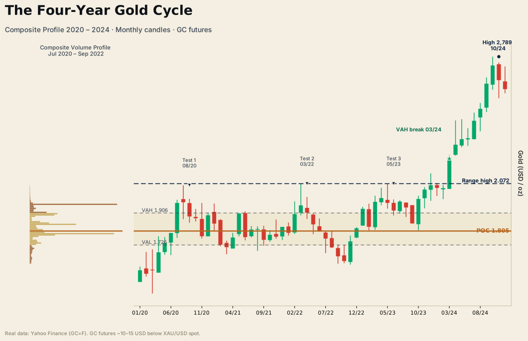
What the market made of it, as of the end of the data on December 30, 2024: the rule of thumb was reached on September 12, 2024. The high after the breakout stood at 2,788.50 USD on October 30, 2024 — the base count of 3,175 thus remained open, around 64 percent of the way covered. And the leg count lay below the breakout edge from the start: the last leg alone would barely have carried the breakout. That is the width lesson of this case in one line — it is not the last run-up that carries the move, the whole base carries it.
Three measurements, three different fates: one reached, one open, one as a lesson. That is exactly what honest projection work looks like. A count that is open at the end of the data has not failed — it was never a promise. And a rule of thumb that was reached does not prove the next one.
Limits & honesty
This tool has clear limits, and they stand here, not in the fine print.
The count is a measure of potential, not a forecast. Wyckoff's own practice underlines this: in his nine buying tests the price target is one check among several, not the reason to trade. A count says how far the built cause can carry — whether it carries is decided by supply and demand along the way. Target zones are worked off and continually checked against the market situation, not waited out.
The convention is yours, not the book's. Book I prescribes no box size. The values in this tool — five points in the model, 25 dollars for gold, each with a 3-box reversal — are teaching defaults, explicitly marked as orientational in the knowledge base. The chart method too is a choice: the tool computes with closing prices; the classic high/low method produces partly different boards. Whoever uses the count fixes box, reversal, method and segment once and documents them in the journal — everything else is cosmetic numbers.
The gold follow-up measurement is hindsight, not proof of predictability. The case was chosen because it is instructive, not because it would be representative. A single case proves no hit rate, and this post claims none. Whether the count delivers a measurable edge in your market, on your timeframe, with your convention is settled only by your own validation following the procedure from chapter 17.
The projector serves one stage, not four. Cause and effect is the proportion question of funnel stage 1. Location (volume-profile zones), signal (structure) and trigger (orderflow) are not checked by this tool — a count does not replace an entry process, it supplies the reach estimate to go with it.
And the obvious: This tool generates no signals and no forecasts. It trains a measuring discipline. What you do with it belongs in your process, your risk management and your understanding of the risk notice.
Case vocabulary
The three anchor terms of this post, verbatim from the WVPO glossary (translated from the canonical German):
Cause & effect (Wyckoff's second law) — "The cause (consolidation phase) must be proportional to the effect (subsequent trend move) — canonically the cause is measured horizontally via the P&F count, not via the range height." (Book I, ch. 9)
P&F count (horizontal count) — "Wyckoff's measure of the cause: columns of the congestion × box size × reversal, projected from the count line (row of the LPS/spring level). Delivers a zone of potential, not a forecast; the vertical measured move is only a proxy." (Book I, ch. 9 + 10)
LPS (Last Point of Support) — "A higher low in the markup advance (phase D). Anchor of setup 2." (Book II, ch. 21)
Whoever wants to read the base this tool measures as a complete market story: the post "Gold 2020–2024 — anatomy of an accumulation" tells the same case from the Wyckoff perspective — who bought there, where they bought and why. The projector answers the question that stays open in it: how far it could carry. And whoever must settle the direction question before the reach question finds in the chart-edge interrogation the instrument that comes before: only once the range is read as accumulation is its count worthwhile.
The case file as audio
Point and Figure Price Target Physics
Two AI hosts dissect the tool along its book sources.
The printable tool cheat sheet
The six key rules of this tool as a printable page for your trading desk — double opt-in, unsubscribe anytime.